Project Gallery
A showcase of my data analysis and visualization projects. Click on images to enlarge or use the links to view the full projects and source code.
Filter by Technology
No projects match your selected filters.

Militarized Interstate Disputes Network Analysis
In this assignment we analyzed the Military Interstate Disputes V5.0 dataset of the correlates of war project using the Louvain and Leading-Eigenvector algorithm. The analysis reveals international hegemony and postcolonial structures as a underlying structures generating military conflicts, aswell as geographical location and sharing borders.
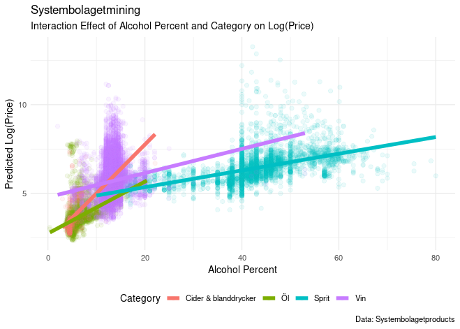
Systembolaget Mining
It is impossible to never hear of Systembolaget when studying in Sweden. I downloaded the productinformation of Swedens National alcoholmonopol "Systembolaget" to investigate the relation between the price and alcoholcontent across different categories of beverage.
Bachelor Thesis
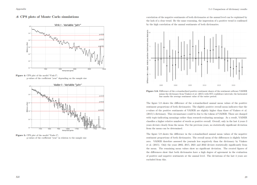
The thesis conducts a sentiment analysis of 121,789 English-language abstracts of sociological articles from the Web of Science database (1993-2023) with two dictionaries to increase validity. Interval plots, linear regressions and Monte Carlo simulations are used to examine temporal trends in positive and negative sentiment. The study provides no evidence for a substantial increase in positive framing.
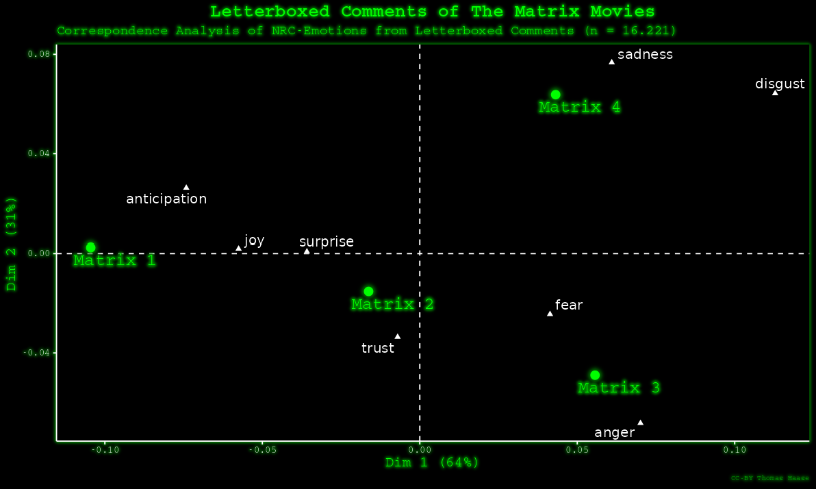
Matrix Movie Comment Analysis
For this project I downloaded all comments for the matrix movies on letterboxed. The results of a sentimentanalysis were analysed with correspondence analysis. I also heavily customized the final plot to fit the styles of the matrix movies.
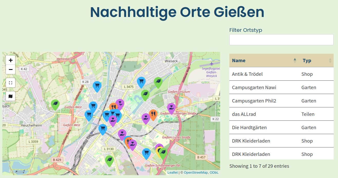
Interactive Map of Sustainable Places in Giessen
For the "Haus der Nachhaltigkeit" seminar during my bachelor I created this Map as a mini-project among others. The map displays several sustainable places in giessen allowing the user to filter for different types of places.
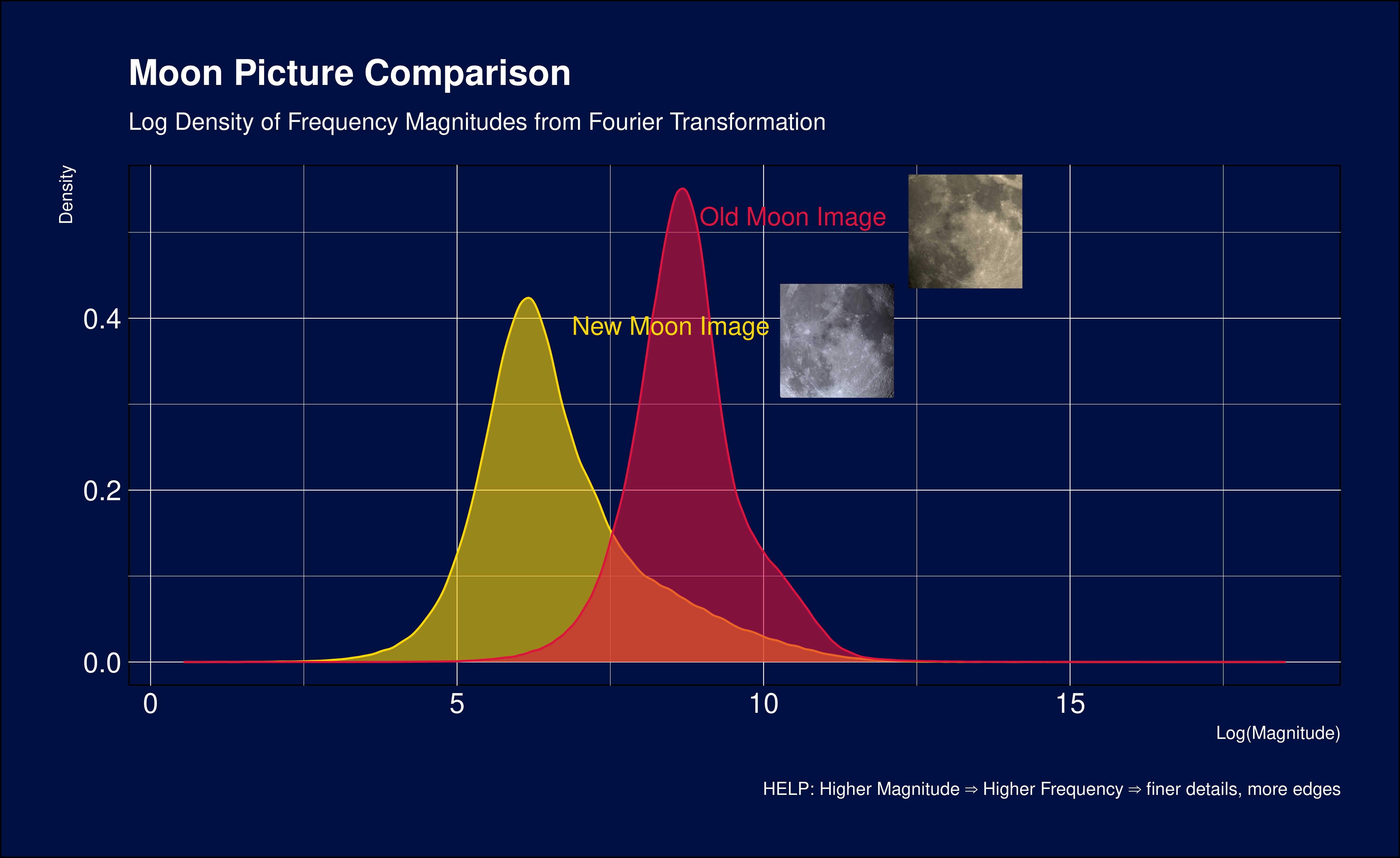
Image Sharpness Analysis
This project compares the sharpness of 2 pictures I made of the moon (More Astrophotography Here).
This analysis helps identify differences in the frequency components between the two moon images. Higher magnitude at higher frequencies indicates more fine details and edges in the image. The density plot shows how these frequency components are distributed differently between the old and new moon images.
Statistics 1 Tutorial Materials
These are the materials I created for the statistics-tutorial for the bachelorstudents in giessen. The selection and order of topics is from Prof. Dr. Dipl-Soz. Elmar Schlüters lecture. I came up with almost all of the examples, formula explanations and practice-tasks.
Statistics 2 Tutorial Materials
These tutorial materials are more of a showcase of my Markdown2Website Tool I made for creating simple webpages quickly where the markdownfiles are directly rendered in the browser.
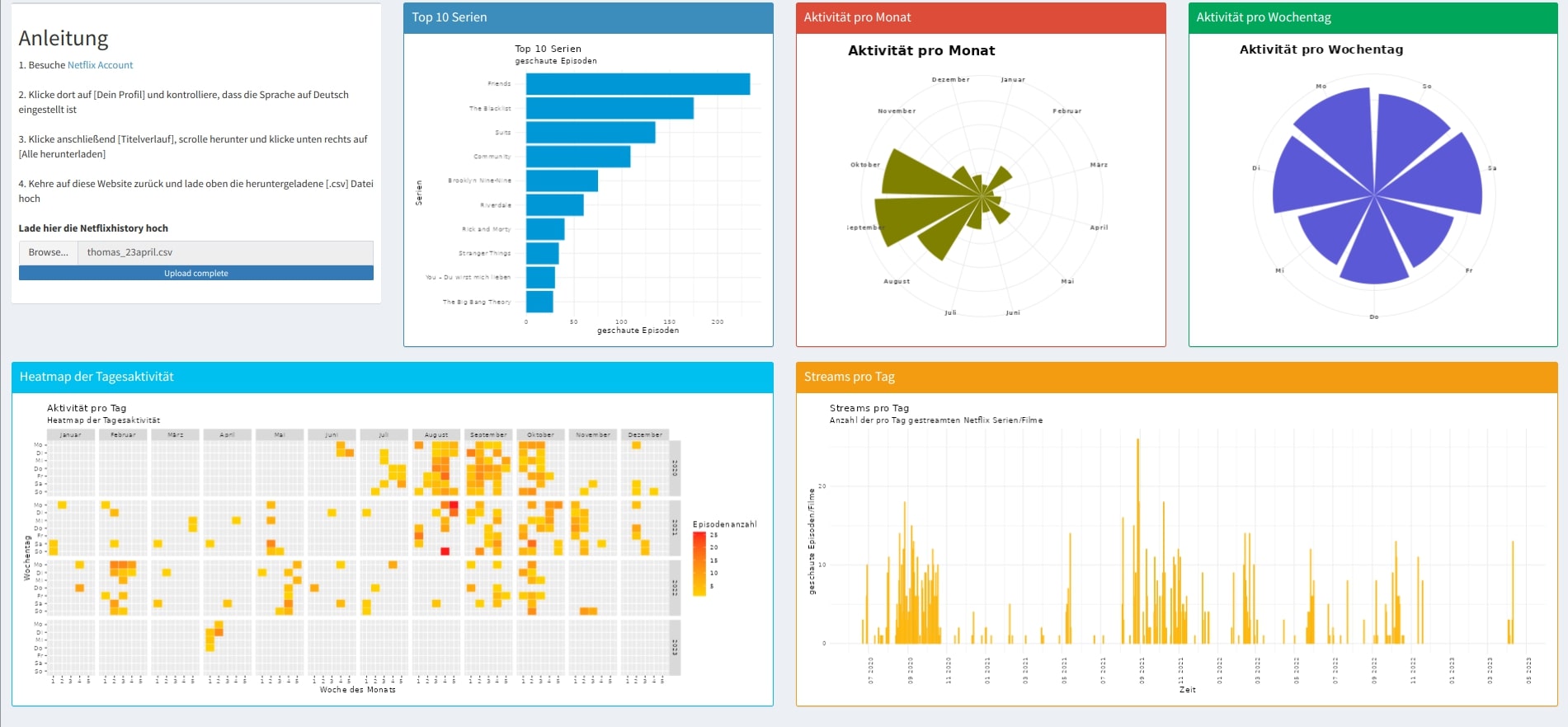
Netflix History Dashboard
This Shinydashboard lets the user upload her/his netflix history wich can be downloaded via the netflix settings. Based on the uploaded file statistics are being displayed. This is my first Shinydashboard which I created 2023.
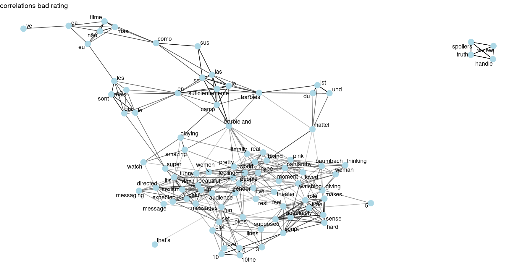
Letterboxed Comment Analysis
This was my first scraping project in 2023. After preparing the scraper I analysed the comments of the Barbiemovie that just came out and was discussed quite heavily on social media after its release. The correlationnetworks were the first networks I ever created in R